Global Logistics
Client
Andrzej W. Chabrzyk
Timeframe
Feb 25 - March 25
Services
Branding Design , Advertising
Project Overview
EUSEA is a logistics company based in Cambodia, specializing in the transportation of food products between Asia and the European Union. Their focus is on delivering fresh goods efficiently and reliably across international borders.
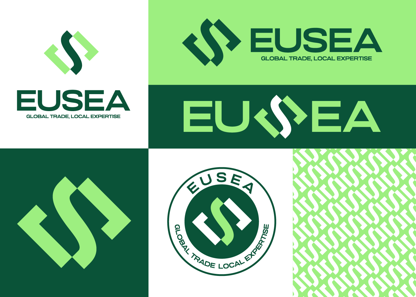
The logo was designed to reflect EUSEA’s core values: freshness, speed, and global connectivity. A modern, clean typeface was chosen to express professionalism, while graphical elements suggest motion and international flow. The color palette reinforces trust and clarity, ensuring the logo works well across print, packaging, and digital use.
Color & Font
The primary color used is green, chosen to represent freshness, nature, and the food industry. The typeface used is Glancyr, selected for its modern and sleek aesthetic, balancing both friendliness and professionalism in the brand identity.
Shape & Symbolism
The logo features a custom shape created by cutting the letter “S” from the Glancyr font. In the middle of the “S,” arrows point left and right, representing the two-way shipping flow between the EU and Southeast Asia. This central element symbolizes movement, connection, and global trade—core to EUSEA’s logistics identity.
Brand Image & Social Media
The custom “S” shape functions as a unique frame for images, creating a consistent and recognizable visual style for EUSEA’s brand. This frame is used across various branding materials and social media posts, providing a dynamic and cohesive way to showcase content such as product photos, announcements, and promotions. Using the “S” frame on platforms like Facebook, Instagram, and LinkedIn helps strengthen brand identity and engagement.
Branding Items
The custom “S” shape also functions as a versatile frame for images, creating a consistent and unique visual style for EUSEA’s branding. This frame is used across various media, helping establish immediate brand recognition.
Challenges
Designing a logo for EUSEA required balancing a professional look with a fresh and approachable feel to represent the food logistics sector. The challenge was to visually convey the international shipping connection between Asia and the EU while keeping the design simple and versatile for multiple uses.
Results
The final logo successfully captures EUSEA’s brand values of freshness, reliability, and global reach. The unique “S” shape with directional arrows clearly communicates the two-way shipping flow, and the green color reinforces freshness. The logo and brand system have been effectively applied across various platforms, enhancing brand recognition and consistency.