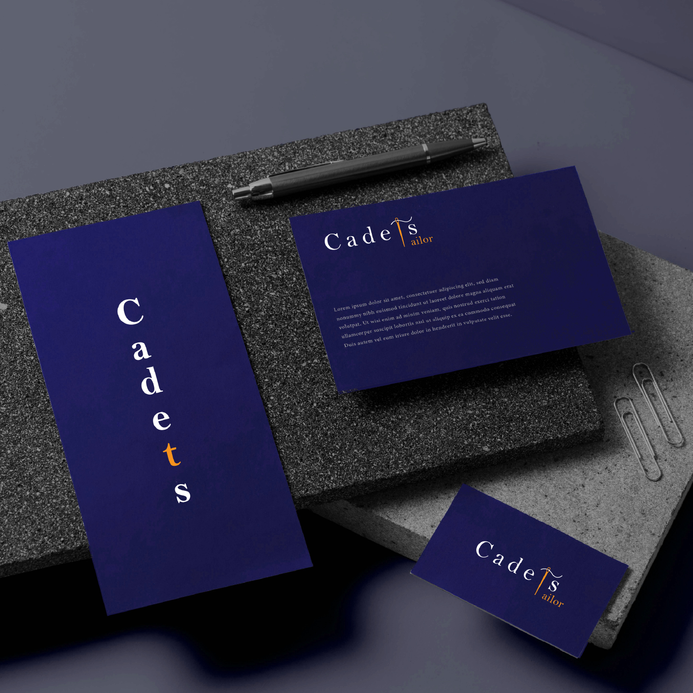
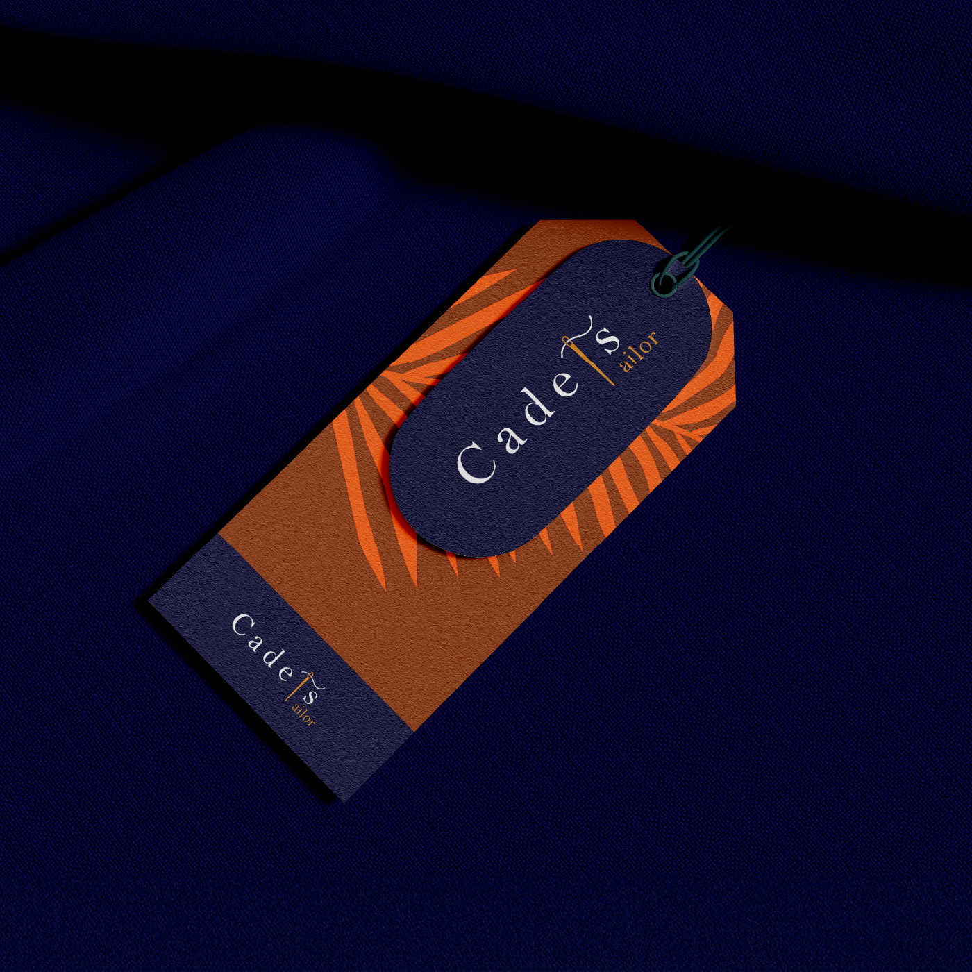
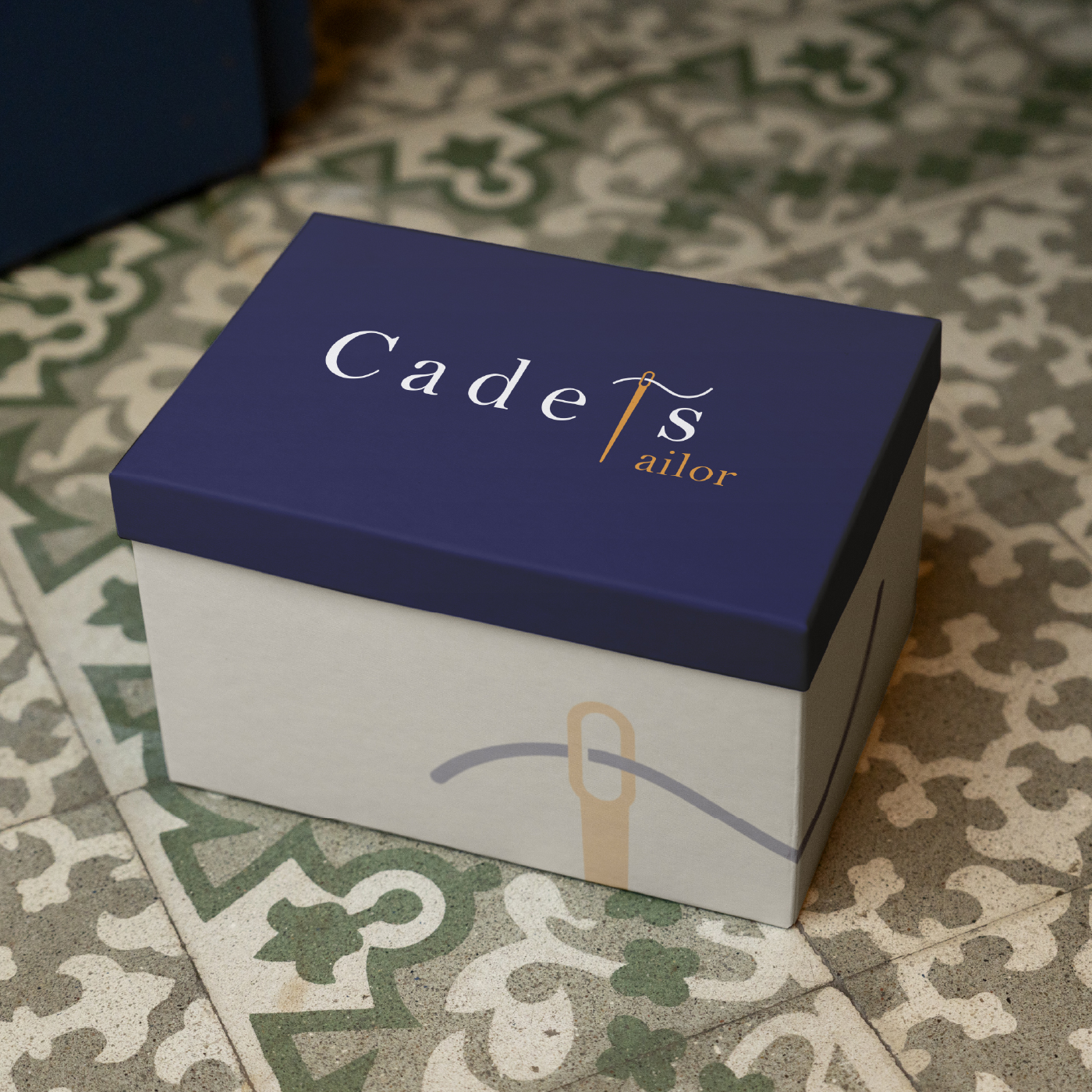
The design for Cadets, Cambodia’s most renowned fine tailor since the 1990s, takes a unique wordmark approach, where the brand name “Cadets” is presented in an elegant, timeless typeface. The wordmark itself embodies sophistication, with a subtle design twist: the letter “T” in “Cadets” is transformed to resemble a tailor’s needle and thread, symbolizing the art of tailoring. This clever incorporation of the needle element within the “T” emphasizes the company’s craft and meticulous attention to detail.
Challenge
The challenge was to create a logo that conveys the brand’s prestigious history while staying relevant in the modern fashion landscape. The wordmark, with its refined and balanced typography, ensures that Cadeth’s name stands out as a symbol of luxury, precision, and exceptional tailoring expertise.
Results
The final design is elegant yet simple, ensuring versatility across various platforms such as print, digital media, signage, and packaging. The needle-tailored “T” ensures the logo retains its identity and craftsmanship, representing the tradition and high standards Cadets has upheld since its inception in the 1990s. This logo positions Cadets as the ultimate destination for fine tailoring in Cambodia, focusing on quality, precision, and a legacy of sartorial excellence.