Bakery Shop Branding
Project Overview
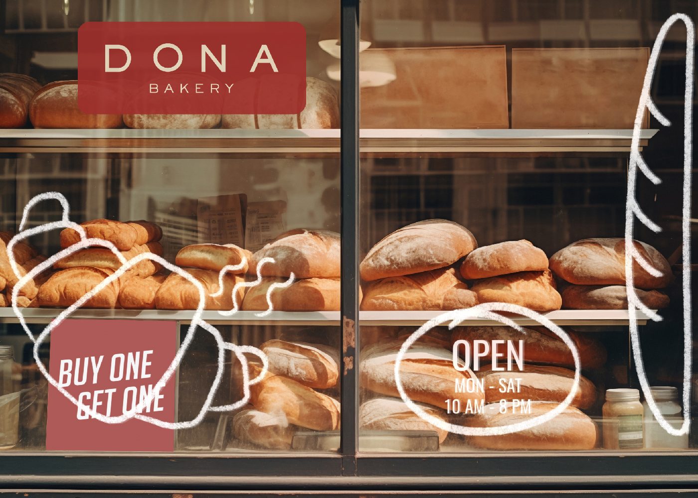
DONA Bakery is a new bakery that aims to bring joy and warmth to its customers with freshly baked goods and an inviting ambiance. The bakery’s mission is to create a memorable experience for its patrons through its delightful treats and heartfelt service. The objective of this project is to craft a logo and brand identity that encapsulates the bakery’s essence and leaves a lasting impression.
DONA Bakery’s primary audience includes families, young professionals, and bakery enthusiasts who value quality and a cozy environment. The design will focus on appealing to this demographic with a warm and inviting visual identity.
Challenge
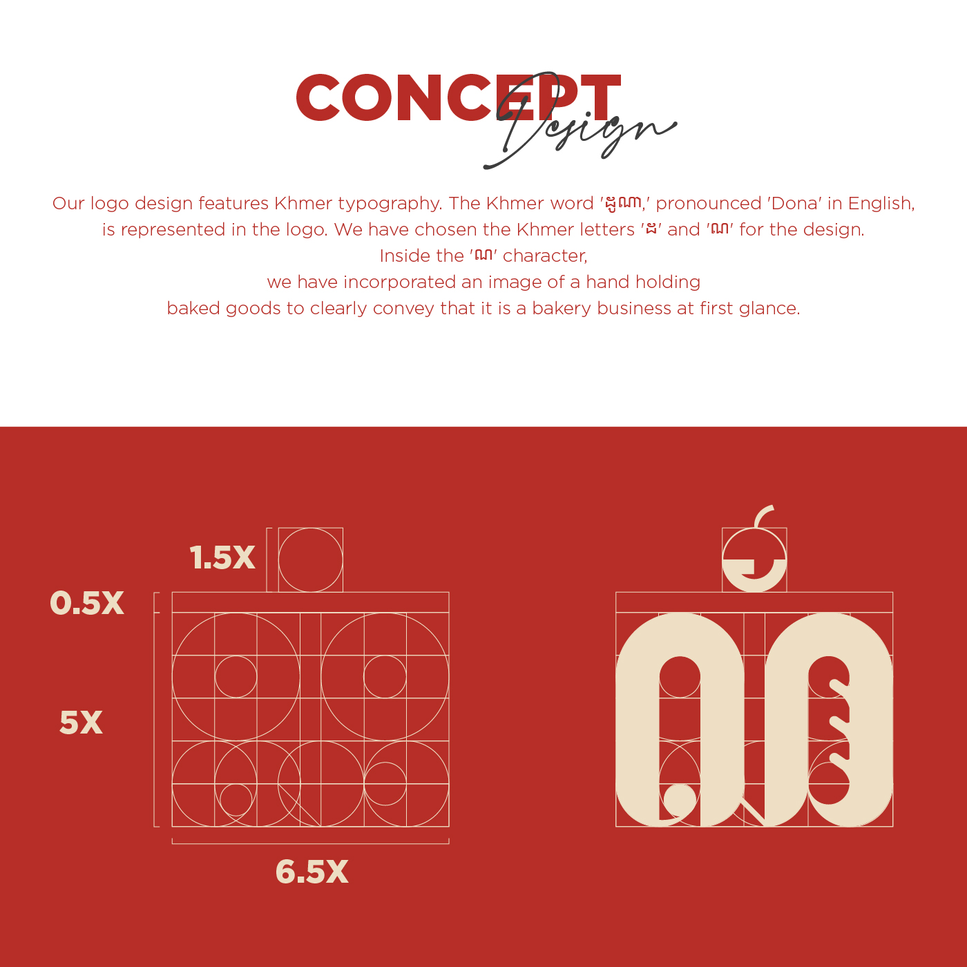
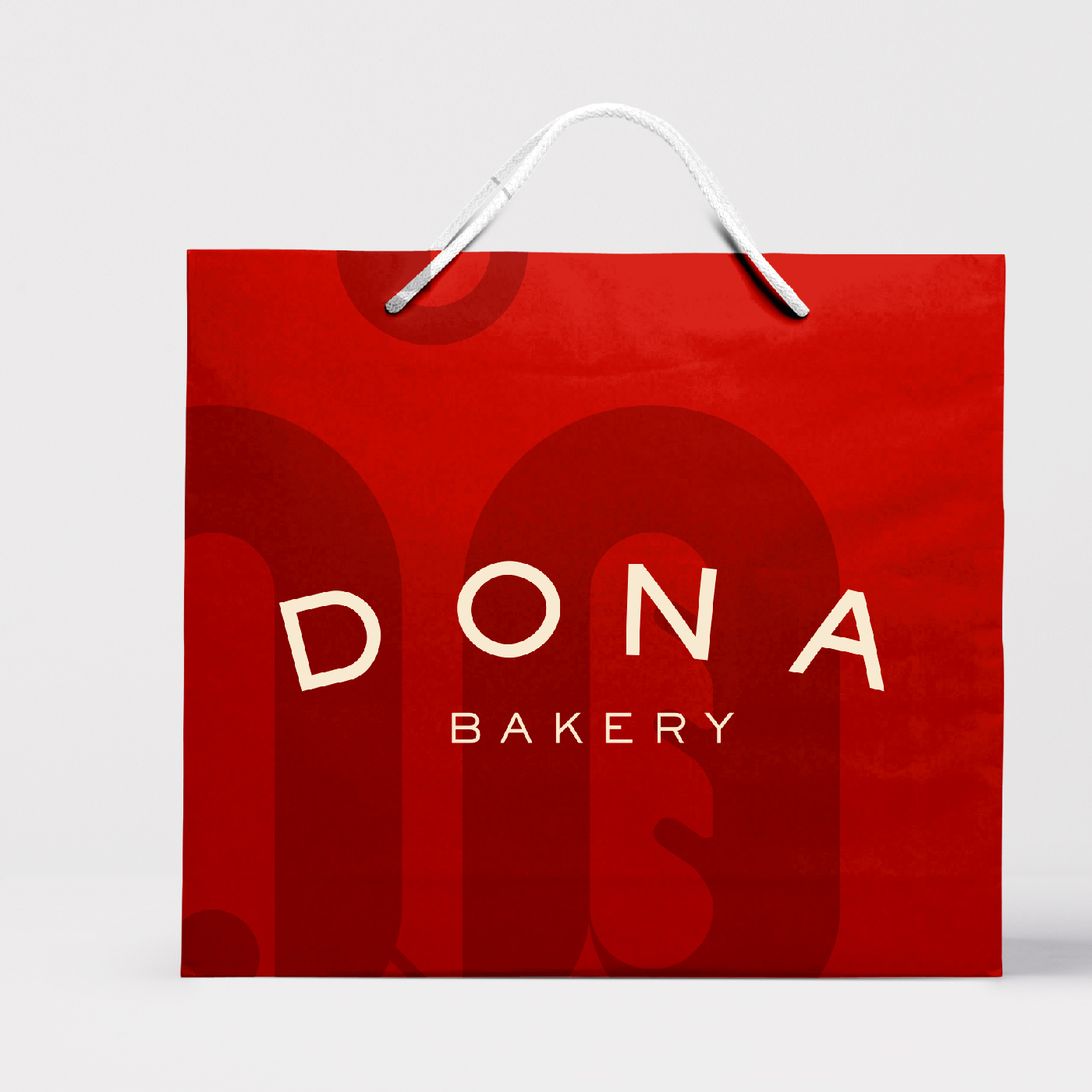
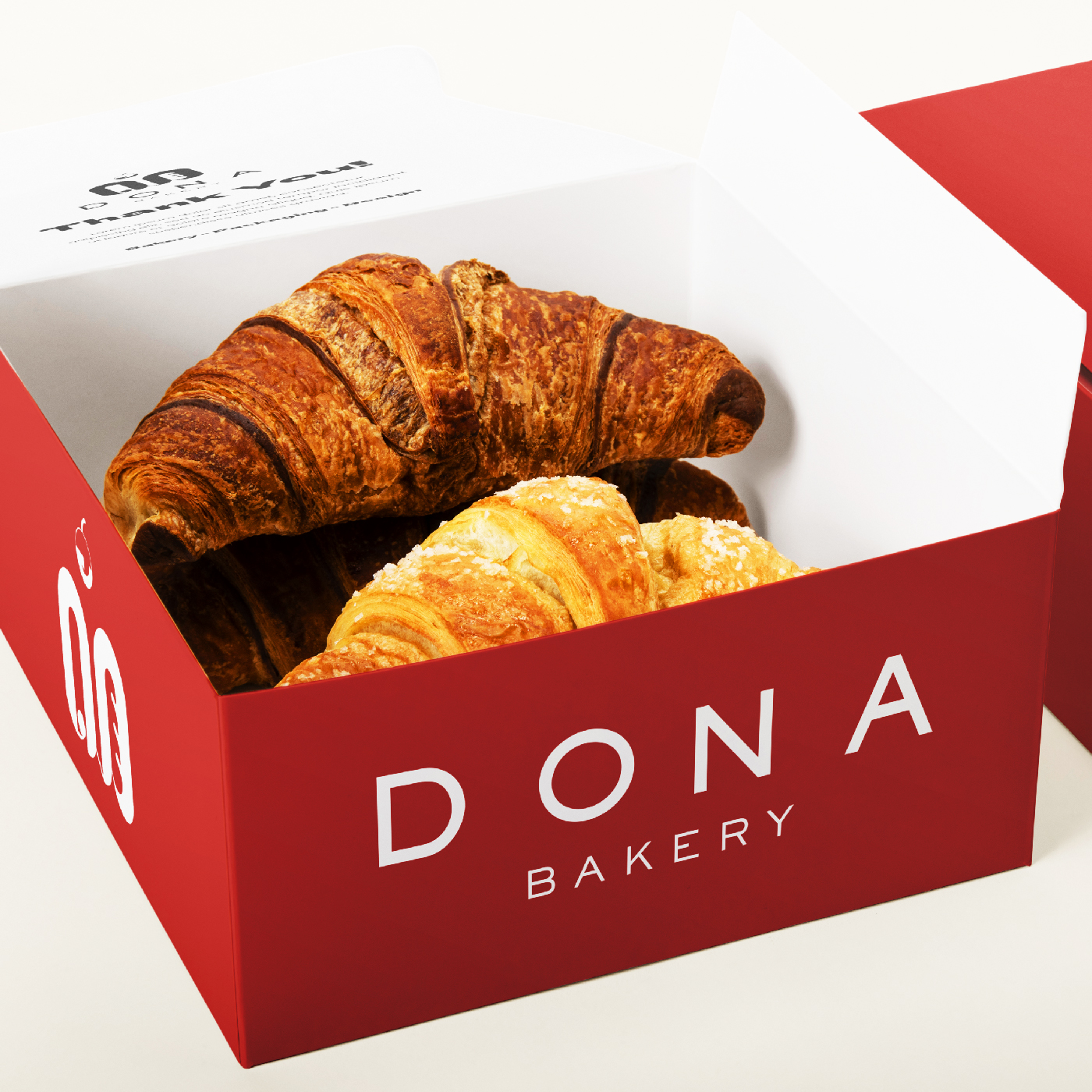
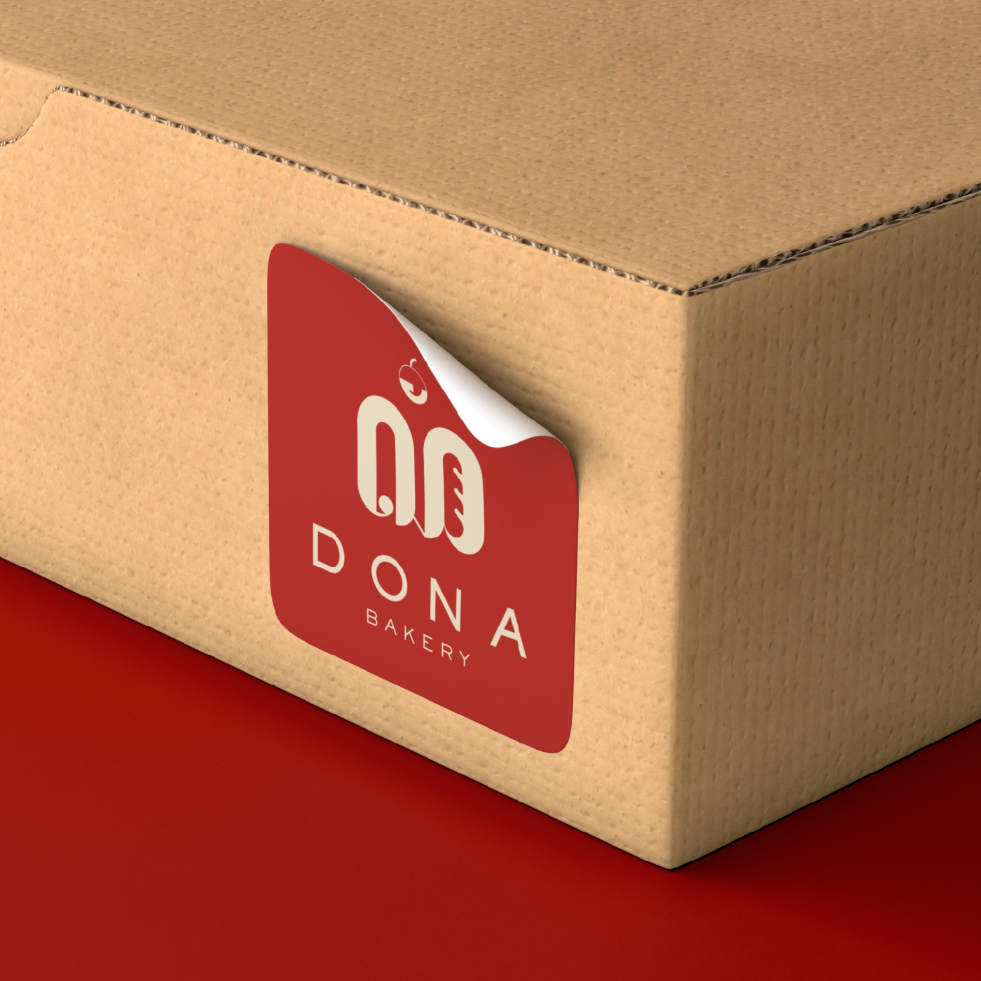
The primary challenge in designing the logo for DONA Bakery was meeting the client’s desire for a design that strongly reflects Cambodian culture while also clearly identifying the business as a bakery. Achieving this required thoughtful exploration of visual elements that would resonate with local audiences and communicate the bakery’s purpose at first glance. Integrating cultural authenticity into the design, such as through Khmer typography, while ensuring it remained modern and visually appealing was a key focus. Additionally, the need for simplicity and clarity meant that every design element, including the representation of baked goods, had to be purposeful and seamlessly integrated. The logo also had to be versatile and adaptable across various branding materials without losing its identity.
Results
The final logo for DONA Bakery successfully fulfills the client’s vision, combining cultural significance with a modern and professional design. By incorporating the Khmer letters ‘ដ’ and ‘ណ,’ the logo proudly reflects Cambodian heritage, creating a deep connection with local audiences. The inclusion of a hand holding baked goods within the ‘ណ’ character effectively conveys the bakery’s identity, making it instantly recognizable as a bakery. The structured grid system ensures balance and harmony, giving the logo a polished and cohesive look. The warm color palette and thoughtful details evoke a sense of craftsmanship and hospitality, perfectly aligning with the brand’s mission. The result is a logo that stands out for its cultural authenticity, simplicity, and versatility, leaving a lasting impression on customers.