Logo And Branding Design

Project Overview
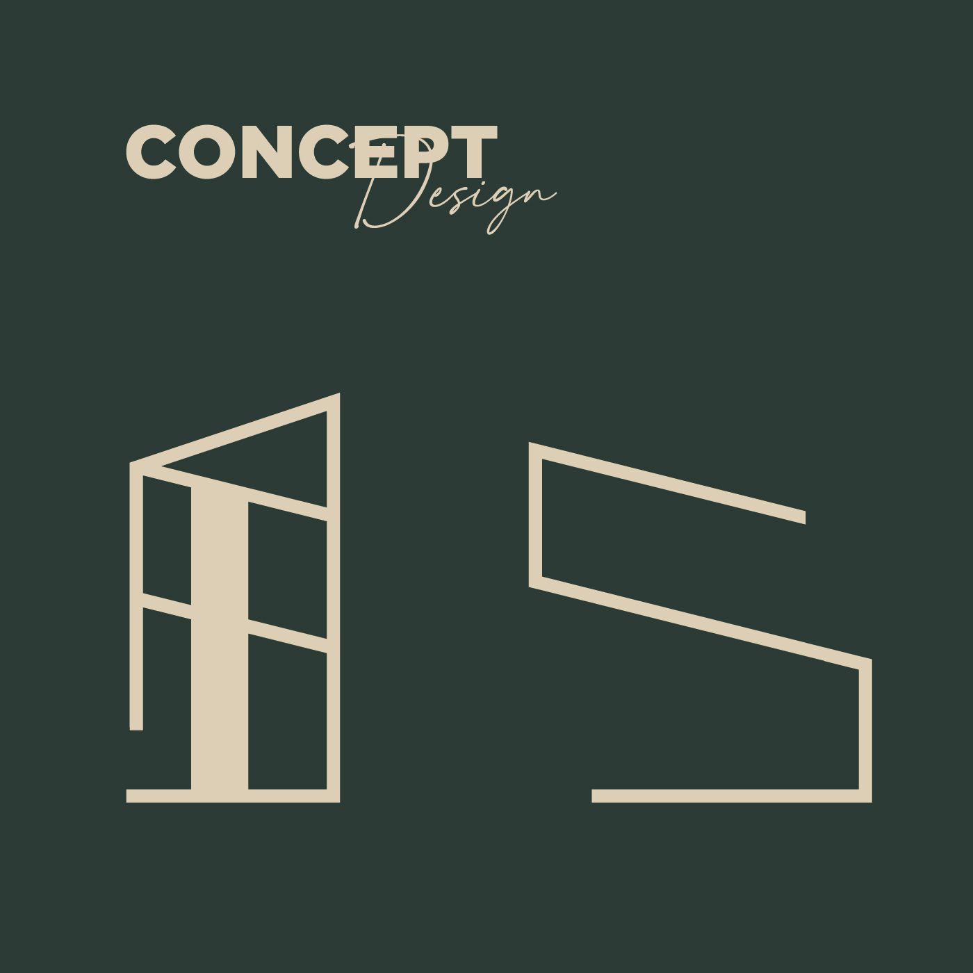
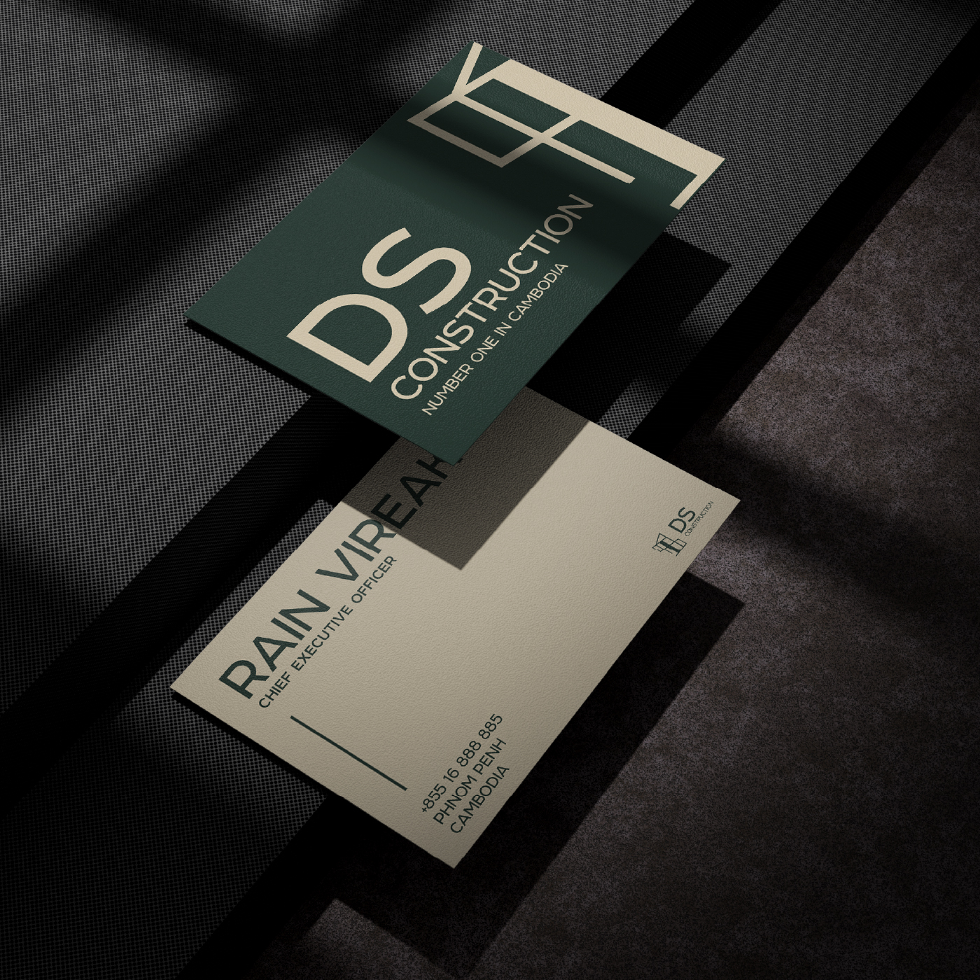
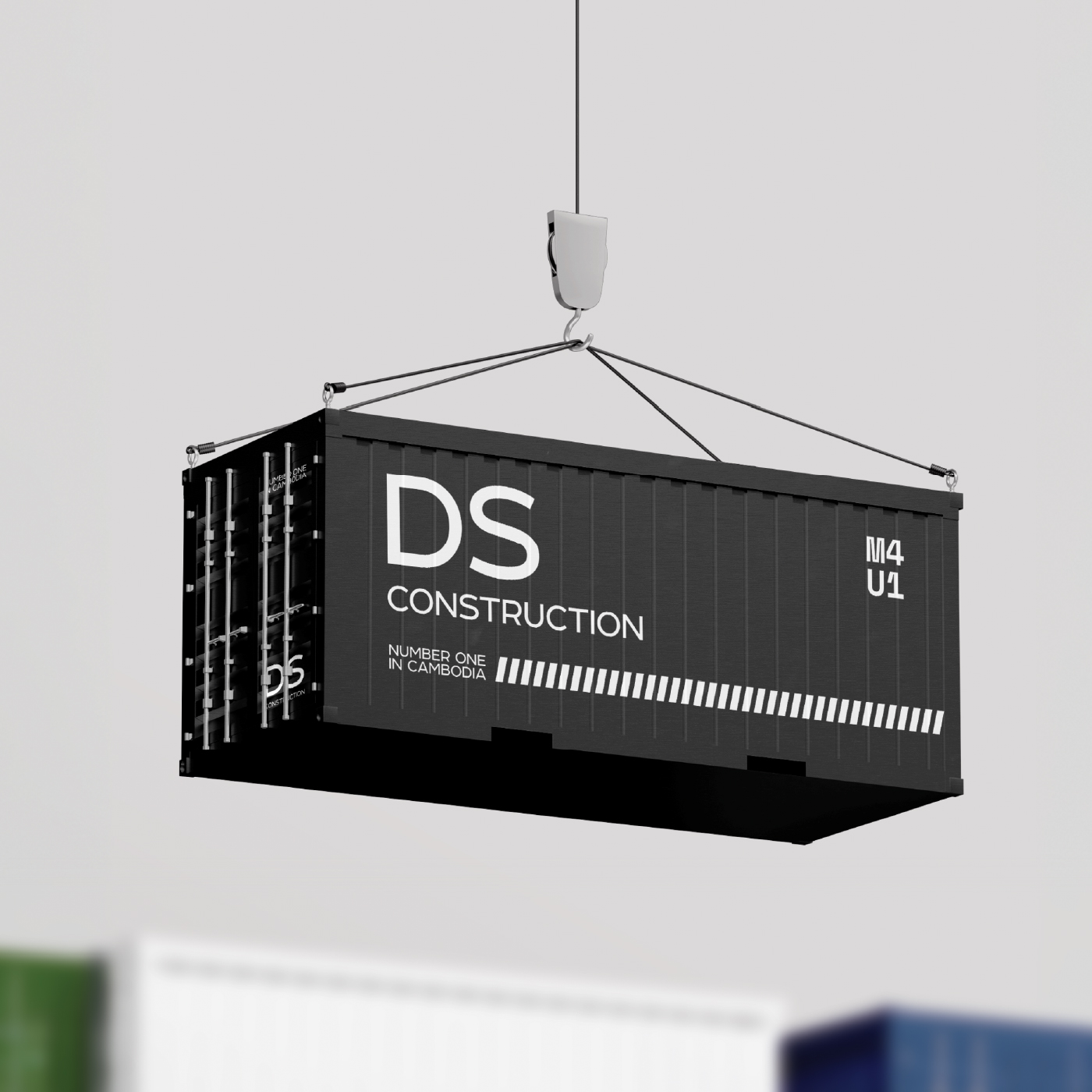
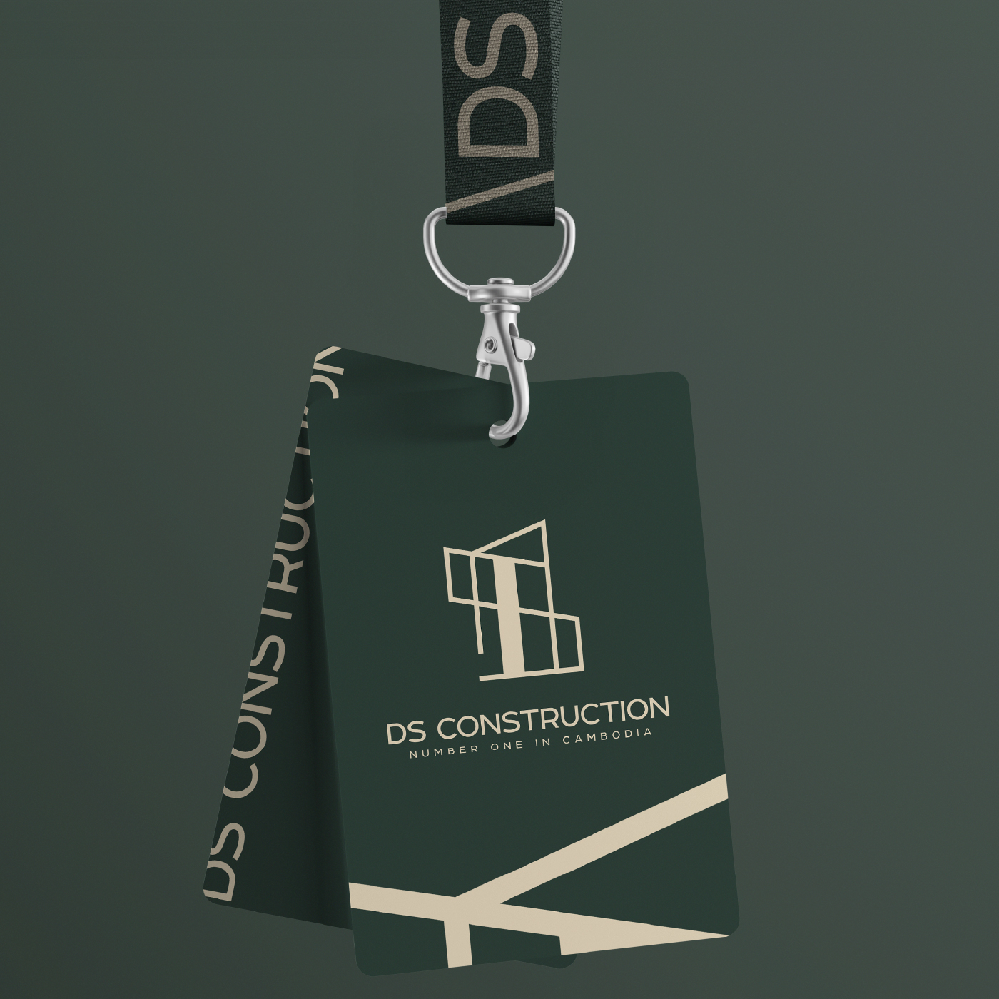
The design for DS Construction integrates the initials “D” and “S” into a bold, geometric structure that embodies the company’s strength, precision, and innovation. The concept draws inspiration from architectural elements, creating a unique and cohesive visual identity that reflects the brand’s expertise in construction and infrastructure development. By merging the initials into a design that resembles structural forms, the logo emphasizes the company’s foundation of reliability and forward-thinking solutions. The minimalist yet striking design ensures versatility for use across various platforms, including digital media, signage, and printed materials, while maintaining a modern and professional aesthetic.
Challenge
The challenge was to craft a logo that not only captured the essence of DS Construction’s technical expertise but also communicated trust and dependability in a highly competitive industry. The design needed to be clean and functional yet visually appealing, ensuring it could stand out in a crowded marketplace while resonating with the target audience. Achieving this balance between visual impact and practical application required careful consideration of proportions, simplicity, and symbolism to ensure the logo would leave a lasting impression.
Results
The final result was a distinctive and memorable logo that effectively represents DS Construction’s brand identity. The geometric integration of the initials highlights the company’s architectural focus and innovation while symbolizing the strength and stability of its projects. The branding successfully positions DS Construction as a leader in the industry, earning praise for its ability to communicate professionalism, reliability, and a commitment to excellence.